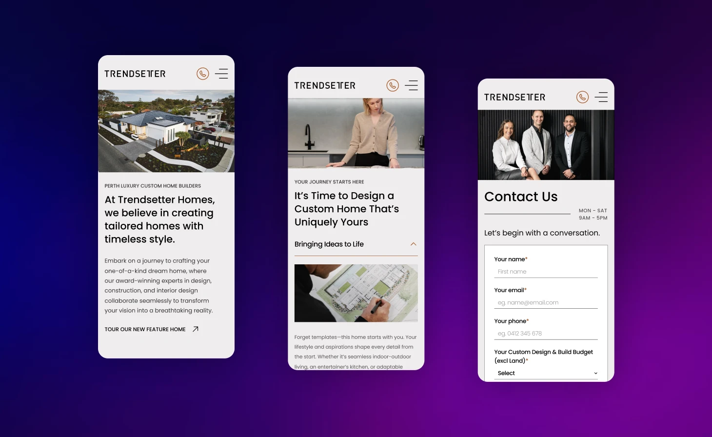
Having a site that simply adjusts to a phone screen is an outdated standard. Mobile-First provides a true competitive advantage in terms of user experience and performance gains. This is to directly address today’s users and search engines demands.
The Standard for Modern Websites
Having a “responsive” website in 2025 is an expectation, and no longer an achievement. The way your business website is built will define a thriving business from the others. Will it offer a unique user experience from multiple devices, or is it a complex desktop design shrunk to fit a phone resulting in a slow, cluttered, and compromised experience? Mobile-First is an intelligent strategy.
At Perth Website Studio, we:
- Design a clean, fast and focussed mobile experience first before intelligently expanding it for bigger screens.
- Build websites that work and WIN on phones.
Beyond Responsive: Why the Mobile First Process Delivers Superior Results
-
Faster Load Speeds, Higher Rankings
Mobile-First design forces a laser focus to ensure things run smoothly. By starting with the smaller screen designs, the resulting code is naturally leaner, and its assets are optimised from the ground up. This delivers quicker page loads, which is a key factor for holding onto visitors and getting a high rank on Google, especially given Perth’s mobile network speeds.

-
User Experience That Is Sharper & More Focused
Developing something for the smaller screen first pushes us to prioritise what is most important, which are focussing on what you are really trying to say, your key content, and your most valuable calls-to-action. This process removes all the unnecessary online noise. The result is a clear path for users on mobile that becomes a simpler and more natural to use, and higher-converting experience on any device.

-
Future-Proofing Your Digital Investment
The old “desktop-down” method often means tucking away complicated elements from mobile your visitors, resulting in bloated code that is a nightmare to update and maintain. A Mobile-First website is designed and built on a clean, solid foundation, making the site sturdier, safer, and easier to grow as new technologies emerge.

Our Mobile First Methodology: Building from a Strong Foundation
We have perfected a disciplined, Mobile-First process that guarantees every website we build is engineered for performance from its very core. This is done by building your digital asset correctly, from the ground up.

Mobile-Centric Content Prioritisation
Our strategy starts by answering one question: “What is the absolute essential information and action a person needs on their phone?” The outcome is a strict content and feature hierarchy that becomes the solid foundation for the whole project

Low-Fidelity Mobile Wireframing
We create the initial structural plans exclusively for the mobile viewer; a step that allows us to perfect the core user journey, navigation, and the steps visitors take to become customers, providing a flawless foundational experience.

Progressive Enhancement on Bigger Screens
After putting a rock-solid mobile core in place, we strategically add to the experience to accommodate larger screens. More layout variations, secondary content, and richer interactive features will result in this “progressive enhancement,” while making no sacrifices to the speed and clarity of the mobile version.

Performance-Driven Development & Testing
We write our code with mobile performance as the top priority. We test everything for speed across a range of real-world Perth network conditions. Our quality assurance ensures it is not just about good design, but speed, responsive, and reliable everywhere.
Your High-Performance Mobile First Website
More than just a responsive site, our Mobile-First approach provides a strategically engineered digital asset built for speed, conversions, and the future of the web.
- A strategic Content and Feature Priority Guide
- A core mobile experience built with lean, highly optimised code
- Progressively enhanced, sophisticated layouts for tablet and desktop
- Industry-leading mobile page speed scores (e.g., Google PageSpeed Insights)
- A future-proof, easily scalable website architecture
- Guaranteed compliance with Google’s mobile-first best practices
- An enhanced user experience laser-focused on achieving your core business goals
Mobile First Design:
Your Questions Answered
What is the main difference between "Mobile First" and "Responsive"
“Responsive” is a website that adjusts to any screen size. “Mobile-First” is the better strategy used to achieve that result which requires designing for the mobile screen first, then improving the site for bigger screens. This creates a faster, cleaner, and more effective website especially when comparing to the old way of shrinking a bulky desktop design.
Will my desktop site look too basic or simple?
Not at all. This is a common misunderstanding. We utilise the “progressive enhancement” method which means that while the mobile experience is uncluttered, we strategically add richer layouts, high-resolution media, and advanced features for desktop users. The desktop experience will feel robust, immersive, and perfectly suited to the larger screen.
Is a mobile-first approach more expensive?
While the initial strategic planning is more involved, a Mobile-First build has a significantly lower total cost of ownership. The lean code means it is easier and less costly to keep the website running smoothly, make updates, and grow over time. It saves you the huge expense of having to re-engineer a slow, clumsy site in the long term to keep up with improving performance standards.
My business is B2B and most of our leads come from desktop. Is this still vital?
Yes, without a doubt. First, Google ranks your entire website based on its mobile version, so a poor mobile experience directly harms your visibility to desktop users. Second, the B2B customer journey uses multiple devices. A decision-maker in Perth could first come across your brand on their phone before researching you more thoroughly on their desktop. That fast, professional first impression on mobile is imperative.
Are You Ready to Adopt the Gold Standard in Web Design?
Do not settle for a website that was simply adapted for mobile as an afterthought. Demand an online resource that specifically built for the world we live in today. An investment in a true Mobile-First process is a direct investment in superior speed, higher conversions, with a decisive competitive advantage.
Choose the way of creating for performance, not just looks.