Let’s cut to the chase – responsive web design is no longer optional for any business wanting to reach customers online. The mobile revolution has fundamentally changed how people access information online. Ignoring this shift is irresponsible and will cost you customers.
The hard truth is that getting responsive right takes work. Migrating an existing site or building a new responsive site from scratch is challenging. There are no shortcuts here. But the payoff for tackling these hurdles is huge. Done right, responsive design leads to better user experiences, increased conversions, and lower site maintenance costs over the long haul.
The enthusiasm around responsive web design is warranted. Implemented correctly, responsive principles allow you to serve a single website to all users regardless of their device. But enthusiasm will only get you so far. Turning the responsive vision into reality requires careful planning, coding, and testing.
Responsive Web Design Best Practices
While making every element of a website flexible is optimal, here are just 8 real-world examples and best practices to help guide your responsive web design journey:
Plan and Lay the Foundations
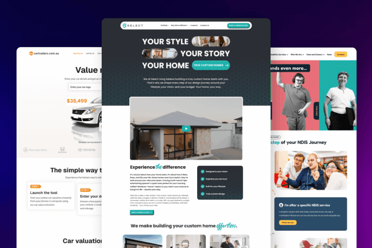
Planning responsive web design projects in Perth is time well spent. Outline technical breakpoints based on content priority analysis. Streamline navigation patterns and audit content rigorously. Eliminate anything non-essential on mobile. The effort involved in planning reduces wasted dev time and prevents painful rework down the road. It provides a rock-solid foundation for responsive success.
Mobile First: Optimise for Small Screens then Expand
Adopting a mobile-first approach is critical for modern web design, with upwards of 80% of online traffic globally coming from a mobile device. By prioritising the mobile experience from the start, you focus attention on the most important content while eliminating anything non-essential.
Limited screen space forces tough choices about what makes the cut. Supplementary content gets cut and navigation is simplified. Then only the core user journey remains.
Mobile-first also means designing for thumbs. Tapping and scrolling differ greatly from mouse use. The best web design services create design elements with appropriate spacing and sizing for thumb access. Embrace mobile-first principles to build lean, optimised responsive sites that delight users on any device.

Mobile should be the primary focus in responsive web design.
Don’t Forget Horizontal Displays
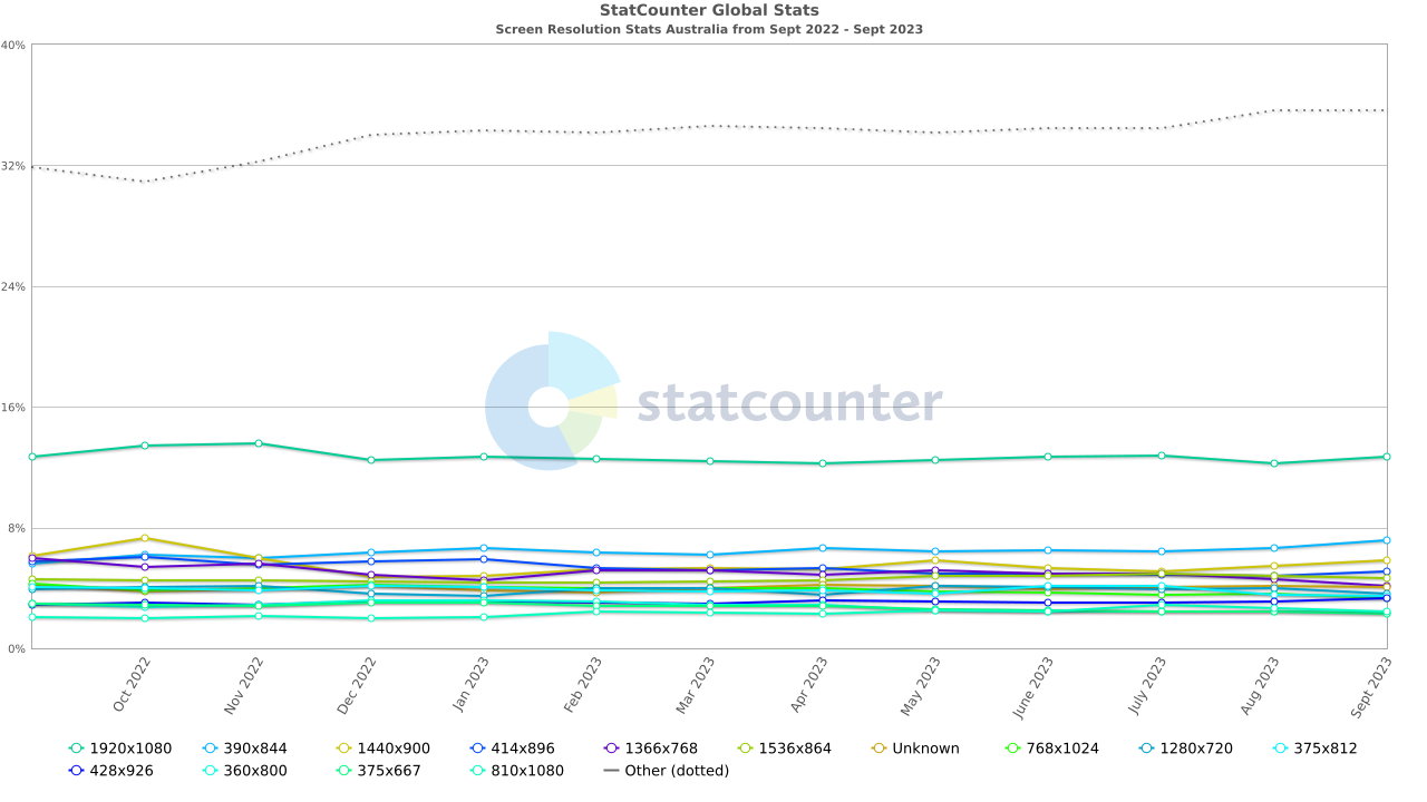
With mobile dominating, it’s easy to only focus on vertical screens. But horizontal orientations still matter across desktop and tablet devices. According to StatCounter, as of October 2023, large desktop displays of 1920×1080 alone make up over 13% of users in Australia, more than any other specific screen resolution.
Test landscape breakpoints during development. Ensure horizontal layouts provide great user experiences on all major web browsers. Supporting all browsers for all orientations unlocks the full potential of responsive web design in Perth.
Flexible Foundations with Fluid Grids
Fluid grid frameworks are the secret to seamless responsive web design in Perth. Using % or em units, fluid grids flexibly resize across any viewport. Fluid units like % or em maintain proportional sizing as screen size changes. Content auto-adjusts without awkward clipping or horizontal scrolling. Frameworks like Bootstrap have fluid foundations built in so that columns, containers and more gracefully adapt across breakpoints. Fluid grids reduce the need for complex media queries.

Responsive web design provides good UX.
Instead of micromanaging each breakpoint, focus on high-level content choreography. Embrace fluidity over rigid pixels. Fluid grids provide the adaptable foundations needed to deliver cohesive responsive experiences.
Beautiful Typography Across Viewports
Optimising typography is critical for delivering immersive reading experiences across devices. Responsive type scales beautifully across viewports when properly implemented.
Use fluid EM or REM units for your type rather than locking font sizes to pixels. Fluid units allow text to flexibly resize based on the viewport width, so smaller screens receive appropriately sized type optimised for reading.

Responsive web design incorporates beautiful typography.
Maximise line length with clamped max-width and test across breakpoints to ensure legibility. Custom responsive typography transforms websites from awkwardly scaled text to immersive reading on any device.
Dialling in fluid type, line lengths and clamping creates excellent reading experiences regardless of device size. Custom responsive typography transforms websites from awkwardly scaled text to immersive reading across any viewport.
Use Media Queries Wisely
Use media queries strategically at breakpoints where content requires layout shifts. Don’t go overboard. Every breakpoint represents debt and maintenance. Test them relentlessly on real devices under realistic conditions. Find the optimal number needed for your content. Too many or too few both cause problems. Think Goldilocks.
Speed Matters: Turbocharge and Test
Site speed is a make-or-break factor for responsive web design and the best web design services know it. Bloated, sluggish sites frustrate users and demolish conversions across devices.

Meticulous testing and optimising are the key to a fast and effective site.
Start by testing site performance under real-world conditions. Identify problem areas dragging down page load speeds. Usually, images and scripts are the culprits, so try to optimise and compress images without sacrificing quality. Lazy load below the fold elements and minify CSS, JavaScript, and HTML files. Implement browser and server-side caching.
While responsive web design adapts sites for any device, performance optimisations make them actually usable. Creating the fastest, leanest responsive site possible improves user experiences exponentially across every screen size.
Tackle Responsive Web Design in Perth with Confidence
Done right, responsive web design minimises website maintenance and creates flexible experiences optimised for any device. These examples and tips should help you overcome hurdles and get on the path to responsive web design success. The road won’t always be smooth, but the effort is guaranteed to pay off.
If your outdated site is holding your business back, partner with a web design agency and the responsive experts at Perth Website Studio. Our battle-tested responsive processes and years of experience help clients succeed on mobile while maintaining desktop integrity. Our web design services plan rigorously, code cleanly and test exhaustively across viewports. If you’re ready to build a site poised for mobile success while delighting desktop users, contact Perth Website Studio. Our team understands responsive web design in Perth inside and out. Let us guide your project to responsive success.